For a sport often described as the “beautiful game,” football has certainly seen an abundance of ugly uniforms over the years. Goalkeeper tops alone have featured some truly hideous designs, but the men between the sticks have mercifully been excluded from this list. Those with weak stomachs should proceed with caution as we rank the ugliest kits in world football history.
10. Kansas City Wizards 1996 Kit
Home kit or away kit – it doesn’t matter so choose your poison. To give you an insight into the psyche of a jersey like this you need context. 1996 was a great time for science fiction and celebrating all things unusual. Kansas City Wizards attempted a psychedelic bright blue, dark blue, yellow, green and red wave pattern intertwined in front of a plain black top. The opposing kit did no favors, keeping the same rainbow look but changed the black to the white background. You expect something a bit more clever from a team named the Wizards.

9. La Hoya Lorca 2013 Away Kit
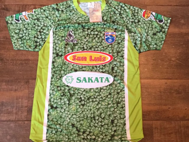
How on earth did it come to this? The lower league Spanish club La Hoya Lorca took advertising in soccer to a whole new level when they adopted a kit completely awash with peas! Yes, the food peas. The disgusting jersey certainly made a splash in the newspapers but their sponsor and club went too far. Considering the amount of PR and expertise in this department for 2013, this is an own goal of epic proportions!

8. Bury FC 1992-93 Kit
Small English outfit Bury had no problem clashing with anyone else’s jersey in the 1992-93 season. This shocking purple/green/silver get up is an embarrassment to the sport and a worthy recipient of being in the Top 20 list. Sponsors Macpherson had no shame putting their name smack bang center of the top which manages to cloak the club emblem. From a distance it looks as though it’s a jersey depicting static on the television with the waving “W” lines painted from side to side. Deplorable.

7. Barcelona 2012-13 Away Kit
Barcelona can play in a woolly jumper for all we care, they’ll still win titles with their scintillating play. But what possessed them to go with an orange and yellow mash up “sunset” style kit for their 2012-13 season is yet to be answered. To make matters worse, their top sponsor the “Qatar Foundation” displays all that is wrong with modern soccer, embracing the money rich oil barons at the center of the FIFA corruption scandal. For one of the wealthiest clubs in the game, this was a moment to forget for the Catalan giants.

6. VFL Bochum 1997-98 Kit
The rainbow pattern simply doesn’t work. German outfit Bochum kept up the camp tradition of bad 1990s kits for their 1997-98 campaign with this atrocious effort. The fabric combined fluro green, yellow, red and orange waves on the sleeve with dark blue, purple, white and half sky blue. The colors have no links with Bochum’s tradition and looks like it’s an edition sent out in celebration of a gay pride parade. Not that there is anything wrong with that, but we know this wasn’t the intention. It’s just a shockingly ugly kit.

5. Juventus 2011-12 Away Kit
The Old Lady Juventus have rejuvenated themselves back into being the European heavyweights from the 1990’s. A season relegated after the scandal that rocked Italian football in 2006 has culminated in a Champions League Final barely months ago, yet their 3rd kit for the 2011-12 campaign left people wondering if they were taking their soccer seriously. Complete with bright pink and a black star, the Juve jersey stood out like a sore thumb and looked about as appetising. Their success subsequent to this fashion mishap is in spite of it, not because of it.

4. England Goalkeeper 1996 Kit
David Seaman was a great of English football. A stalwart for the Arsenal defense that won trophy after trophy, it was expected that the man between the sticks with the big mustache could be a colossus and help England win their first major football trophy since World Cup 1966. None of that eventuated, instead the goalie had the humiliation of wearing what can only be described as a car crash of a jersey. The combination of bright red, purple, green and yellow has to be seen to be believed, an utter travesty of a design.

3. Mexico Goalkeeper 1994 Kit
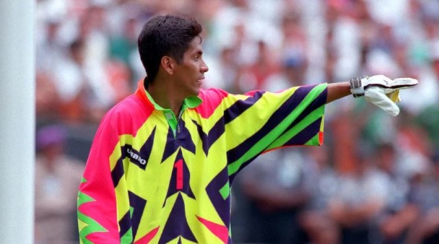
Goalkeepers need to stand out from the crowd. In tight spaces, the man or woman with the gloves need to be able to be differentiated to avoid heavy contact in the penalty area. Fair to say Mexican keeper Campos had no problem achieving this in the 1994 World Cup. The Christmas tree on steroids styling somehow got the tick of approval and to this day remains one of the seven wonders of the world.

2. Coventry City 1970’s Kit
No one should need an explanation why a brown soccer jersey is a bad idea. Former top flight English club Coventry City threw away any notion of fashion sense by adopting a pure brown jersey and shorts with double white stripes lined down the sides. Mix this in with some funky haircuts and facial hair, and this was a mess of epic proportions. Coventry quickly reverted back to their sky blue colors and haven’t been tempted by the brown since.

1. Colorado Caribous 1978 Kit
Is this a professional soccer team or a Dolly Parton tribute act? Quite frankly, there aren’t enough words created in the English language to explain how horrific the formerly named Colorado Caribous’ 1978 kit is. One feature stands out above all others for obvious reasons, creating the image that the players would prefer to be at a rodeo than on the soccer pitch. After 19 of the ugliest entries you will see in the fashion world, Colorado takes the cake for the ugliest of them all!


